Sunday, 17 November 2013

Project 4 - Almost Finished


Well, this is my final project hanging. I will raise it up to shoulder height for the exhibition, but as I have been doing the final touches, it was easier to have it lower for now. When I raise it up to the right height i'll work on getting a better front on shot than the one just below.
For those of you who haven't read the rest of my blog, I'll do a full write up on the piece and concept, as well as an evaluation for myself and my tutors :)


This piece is about a friend of mine who has two personalities, and both of them fight over control of their body, but at the same time they need each other to stay strong, and whole.
Another way to read this piece is about human psychology as a whole. We are all full of conflicts and contradictions - obvious ones, like love and hate, sad and happy, angry and amused. And more subtle ones, like how we act slightly differently depending on who we're around, and we all have a side to ourselves that we never show anyone else, one that is often in contrast to what everyone sees.
Using myself as an example, I'm a very shy person, but I try to be more outgoing, to be friendly even to strangers. So I try to hide my shy self, so people don't see it, and yet, I often think of things I want to do or say, but am still to shy to do or say, so I have another self, more hidden than my shy self, that is in complete contrast to my shy self. 


This whole piece is designed off something that is traditionally wearable (armor) but here it is purely sculpture. I have intentionally made it difficult to try to put on. The tail piece of leather hanging down would make it highly impractical to wear as well, not to mention to use it as armor, but for the sculpture it is designed as, the tail piece adds an extra dimension as it curls down and around the semi-sheer silk. It encloses the silk and creates a sense of wholeness about the piece, instead of having this shoulder piece with the silk hanging down looking like a separate thing.

I should really go right down to the basics to explain the whys and whatfors...
I have chosen my materials to try and portray the contrasts in my concept. Silk and leather; something soft, delicate looking, but so strong when braided into a rope, something tough, and thick, known for its use as armor, but when leather has been prepared for use as armor it is not soft, or nice to feel... Then there's the fur on the shoulders, which is soft and silky to the touch, but it is still animal skin.
I left most of the leather the same colour it came as, and the silk a plain white, but have placed two brilliant red tabs of leather at the front of the shoulder piece. The plain, undyed silk was to symbolise innocence, purity and an uncorrupted soul. The red leather tabs show a partial corruption of the personality symbolised by the leather - corruption by hate, and rage, and all those fiery red emotions that burn inside a body. The placement of the red tabs was chosen with a necklace sort of thing in mind, for the feature of a necklace hangs down the front, over the heart area, and the emotions portrayed in the brilliant red are of the heart, so should be over where a heart would be if this pieces was to be worn.


The long fall of silk that reaches from the shoulders to the floor is to give the suggestion of a body, without suggesting that this piece is meant to be worn. I used silk to fit with the concept and the fabric I used to thread the piece together, and I found the thinnest I could, so that when a person stands facing this piece they can see all the layers and folds of the silk as it hangs, as well as a shadow of the tail, twisting around and down. The thinness creates an ethereal spirit body, which is how spirits and ghosts are often portrayed in movies and images in our culture. And what is a personality but the ghost or spirit when it is inside the body - the Soul. The silk pools on the ground below the piece, grounding the piece that otherwise has no contact with the rest of the room, or even this world of ours (the piece is hung with clear nylon cord, barely able to be seen).


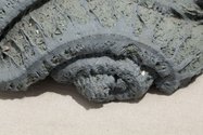
A closer look at the leather parts of this piece shows a fine coat of silk fibres, cobwebbed across the surface, like veins, or lines of the web of life. It can be very difficult, when working with unhemmed silk, to not get little threads of it floating around, so I decided it is better to go with the properties and quirks of the materials I use, instead of fighting it. As such, I have picked out threads of silk, and draped them over the piece to create this web look.

Project 4 - Theorist Influences

I find myself drawn to Freud's theories on repression as something that relates to my concept. The theory goes that people repress memories and desires that they cannot consciously cope with, Freud encouraged people to try to consciously remember these repressed memories through a method commonly known as "the talking cure" during which a patient would lie on a couch and look up at the ceiling, and talk to the doctor who was sitting at the head end of the couch, just out of sight. Freud discovered this as a good treatment for some metal illness' and problems.
The reason my friend has split personalities is because she went through enough trauma as a very young child that she simply could not handle what was happening, so to cope, she hide herself away, and created a much stronger personality who was able to handle things. She could not bring herself to hate the person hurting her, so she created someone who could hate, someone who was completely made up of hate and anger, born of pain and fear. Even now, when she's not going through the same things, she cannot get rid of this other half, for her other half has grown up too, and is too strong to just disappear. Of course, there's always the question, even if she could get rid of her other side, should she? Does she have the right? Her alternate personality is just that,a personality, a fully fledged person, to get rid of her would be to kill her.


Project 4 - Artist Influences

I have been influenced by quite a few artists for this project. I'll just give a bit of information about some of them, with a link to more information in case any of you want to learn more about them and about why they're so amazing :)

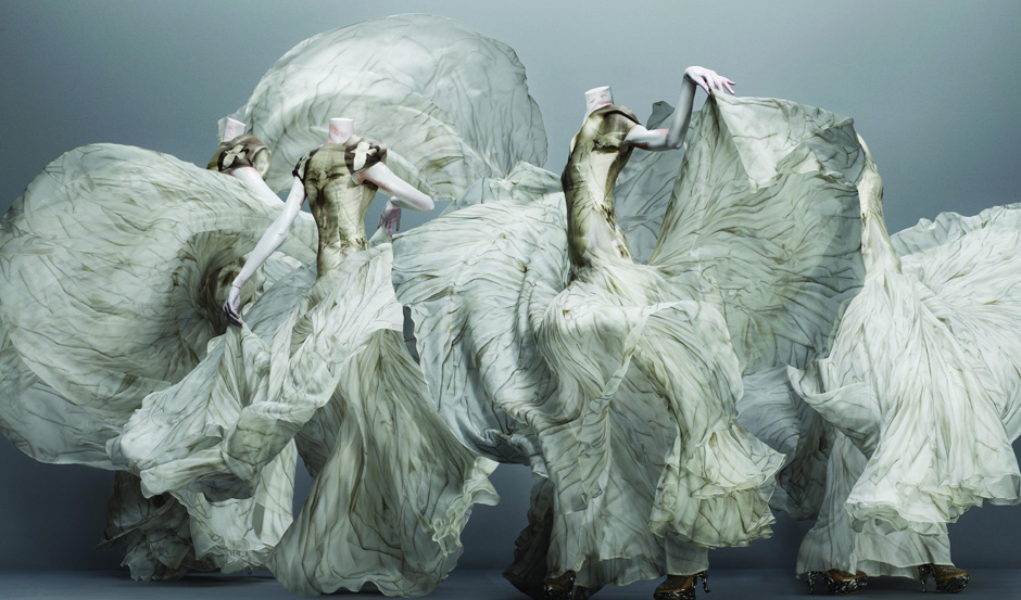
Alexander McQueen: Alexander McQueen was a contemporary fashion designer, who made garments that were as much sculpture as they were clothing. I love how out there much of his work was, rendering it useless in everyday life, but so expressive if you stop running around life, and actually look at it.


The way the lines and fabric flows, and creates movement fascinates me, especially since this is a still piece, on manikins. It gives the whole piece a kind of ethereal look, which is something i'm aiming at for my piece when it is exhibited.

http://en.wikipedia.org/wiki/Alexander_McQueen
wiki info about him

http://blog.metmuseum.org/alexandermcqueen/
Information on McQueen's exhibition "Savage Beauty"


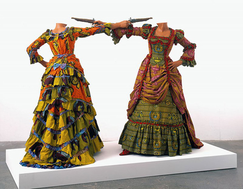
Yinka Shonibare:
Shonibare uses fabric and costume to explore the ideas of cultural identity, colonialism and post colonialism.

Shonibare dyes and patterns the fabrics he uses himself, and creates stories out of his pieces, all set up on manikins like scenes from a play.

http://www.ofnotemagazine.org/2009/09/01/yinka-shonibare-the-art-of-victorian-dress/
comments on Shonibare's exhibition "The Art of Victorian Dress"

http://www.yinkashonibarembe.com/home/
Shonibare's artist website


Julia Morison:
Morison is a New Zealand artist who plays with painting, sculpture and print, and does a fine job of it.
Her work tends towards surrealism, and in her 2011 exhibition in the Two Rooms gallery in auckland, her work was heavily influenced by the christchurch earthquake.

Julia Morison, Laconic Thing (detail). Photo Jennifer French
she used liquefaction silt in many of her pieces, including using it to paint with.
http://eyecontactsite.com/2011/11/morison-sculpture-in-auckland

 image
This pieces appeals to me because of the way the dress extends down to the ground, and effectively becomes part of the ground, which grounds it in way. The piece hanging free in the air, and the grass bringing it back down to earth, but not in a bad way, more in a sensible way.

http://juliamorison.co.nz/
Morison's artist website

Sunday, 20 October 2013

Project 4 - Colour Tests

 I have been doing tests on my scale mail, and what the best colours and patters would be.
Here I have used pink silk on plain leather, which I personally think looks nice, but does not really create enough contrast for the concept.


 This white silk stands out much better than the pink, and in some cultures (like the western culture, which is quite prominent where my friend lives at the moment) white stands for purity or innocence, which suits the original personality very well.
As you can see I have been doing the weaving by threading the strips of silk onto a large needle to make it easier to get the silk through the holes in the leather.

This is a large sheet of leather tabs that would be the front of the piece if it was final. I have made this to show how the leather looks in that colour in a large group. The top right tab has a goat skin trim, though I have now decided not to use this on all the tabs, because it is too difficult to make it all look tidy, and it would take far too long to trim all the tabs like so, when I only have a few weeks left.


 This is a card example of one colour set I was thinking of using. The brown stood for the fur trim, and the pink ribbon for the silk. The contrasting light pink and vivid red where to show the differences in the personalities. Red for strong, violent and volatile, and pink for soft, innocent and easy going.
This is the same as above, but without the fur trim. I think this will end up being too strong without the brown to break the red up, and other things may get lost in the strength of the red red red.

Saturday, 21 September 2013

Project 4 - Scale Mail?

Scale mail is a type of armor that is made up from many small tabs attached together. I am using leather, though it can be made from pretty much any material solid and tough enough for armor.
I chose to make scale mail instead of using one large piece because it allowed me to weave the leather and silk in amoungst each other, rather than having large, separate areas of materials, as the two personalities are woven into each other, rather than being two completely separate identities. They can never really be without the other, they are a part of each other, and I wanted to make my piece show this better than it was when it was one solid piece.
I will go more into this once I have done some more work on my physical piece and have some photos to put up here.

Project 4 - Concept Development Update

Out of my varying interpretations of my concept, I am finally managing to pin it down to one thing. So I am going to do a scale mail shoulder piece (I will go more into scale mail and why next time) and the whole piece will represent my friend/subject. One piece of body wear to represent one person. To represent the two personalities I am going to use two fairly opposite materials - leather and silk. Leather is tough, thick skin, hard to hurt, and good for protection. Silk is soft and delicate in appearance, if handled coarsely it will roughen and lose it's sleek shine. I will use the silk to weave the leather tabs of armor together, to represent how the two personalities hold each other together and protect each other. Even though they fight for control of the body they also keep each other together.
I am also intending on edging at least some of the leather tabs with goatskin fur, which is soft and smooth to touch, but still it leather in a way, it is still an animal skin, and tougher than many materials of a similar softness. This is because sometimes the two personalities almost seem to be one again, if (for example) they are talking about or doing something that they both totally agree on. This may not happen very often, but there are times where the softer, more innocent one is harder, and the tougher one softens.

Sunday, 25 August 2013

Project 4 - Critique Results

We had our first critique for this project last week, as I expected people didn't really get my piece without prompts from me, but that is largely because it is just not finished to a stage where people might get it.

I had two drawing manikins holding up a marionette puppet I had quickly made, I used the manikins simply because I did not have anything more suitable to use, and the idea was two personalities fight for control over one body, which was the puppet. People got the control idea, but they saw the manikins as outside influences - parents, governments, etc
I also had some samples of boiled leather I had done and my little leather mock ups displayed, but people could not get any idea of a concept from that.
Most of the suggestions people had were things I was intending already - larger/life sized pieces for the real piece, and more development of the concept.

Overall I am not disappointed with the results, I knew it was too early for people to really get my concept from my mock ups, I just need to keep working my concept into the piece and develop both further.

Tuesday, 13 August 2013

Project 4 - Boiling Leather Tests

In medieval times a very common way of making armour was to boil vegetable tanned leather, and it would become hard and stiff. This was basically done by soaking the leather in luke warm or cold water for at least ten minutes, to allow it to absorb the water and soften slightly. Then by dipping it in water kept at just below boiling point for about one to two minutes, maybe more or less depending how hard and brittle it is to become. Leather boiled for longer will become harder and more stiff, but it will also become more brittle.
I found good instructions and some back ground information here, thank you to whoever wrote this article.
I tested 9 small strips of leather (three 5mm thick and 6 2mm thick) soaked for the same length of time (about 10 minutes) and boiled for differing lengths of time to see how stiff and hard each would get. They range from a fairly soft 20 sec thin one that still mostly holds it shape to a solid 90 sec thick one that will only allow limited movement with some force applied.


This was a very small mock up of one of my ideas, to give me a vague idea of how it would look in 3D. I was quite pleased with the result, especially with the way the edges curled up, as it gave the piece more of a flowing, sculptural look.

So naturally I did a slightly larger mock up too see how the thinner leather would hold up to more weight, and how it would react in the way it hangs and curls. I added a small amount of copper chainmail to the bottom because chainmail is an interesting way of extending the piece without having to buy and order in more leather, which is out of my price range at the moment. As you can see, the mock up is a bit too big for the wooden doll I've put it on...

The leather hasn't curled up quite as pleasantly, but with some encouragement during the drying process I think I could achieve the desired result, but not if I have to do this in the thicker leather, which is what I will probably have to do, as this leather is too... uh, floppy. Even at this size it's already looking less like armour than an odd fashion garment.

Project 4: Concept Development

Another way of looking at my concept is the way both the personalities fight each other for some control over the one body. This has reminded me of a marionette, with one body and two people fighting over who gets to pull the strings, and even when one person does have control, they still have the other next to them trying to tell them what to do.

This is Bob, a quick marionette I created out of a few sheets of paper, some string and a set of chop sticks. This is a simple 3 string marionette, however I would like to make a more complex one when time and resources allow, to see how difficult it is to make one, and to see how one would move. This is a possible influence for my final piece, as it could represent the body, then I could find a way to represent two personalities fighting over the controls. I have some vague, half formed ideas for this so far, but nothing solid enough to try or test.

So far I am looking at this side - the struggle between personalities - as a separate idea to the protection idea, however I will look into ways of combining the two, showing both a conflicted and symbiotic relationship between the two personalities.

Project 4 - Initial Design Ideas


This was the first idea I had for the sculptural armour influenced piece. It would be made of boiled and hardened leather, as armour often was in the medieval era. It would be a lot of leather though, and I would need something big enough to mould the leather onto to set after boiling it.


This is an idea I had for an installation piece, where I would create a whole room of soft pink lighting and soft comfortable cushions, with a "buffer" around it of darkness that you had to walk through to get into the room. The darkness would be the bad things that need to be escaped, the room itself would be talking about my friend's alt, who gives my friend shelter from the darkness of the world when she needs it. The cozy pink lit room would be the safe haven my friend creates for herself inside herself when the world becomes too much for her. This would give people a sense of being inside a little world - inside her mind.

This would be two masks, each decorated to reflect a personality, which are stuck together to become one piece. A two sided mask as such.
I find this imagery kind of creepy, partially because the idea of someone having "two faces" implies one is traitorous rather than having two personalities.

These two were quick ideas I thought might work, but upon seeing them on paper I decided they were not really expressing the concept how I would like to see it expressed. The first (left) is a robe like design with solid leather shoulder pieces, and a long draping fabric merging with the leather and coming down to form the robe part. The second (right) is based on a merging of an evening dress and scale armour - armour made up from lots of sclae pieces of leather or metal, in this case leather - the idea being to show the two personalities
in one garment. However at this point I want to give an impression of inside and outside as well as two.

This would be made from one piece of thick (approximately 5mm)
leather to create the shape and give the impression of armour,
and would be lined with some soft material that is pleasant to touch,
possibly baby goat (kid) skin, as I already have some of them that
need using. I have created a circular open area above where the
heart would be to give people the impression of seeing passed the
thick armour outside and into the heart of the piece. This piece
would be hanging free rather than placed on a stand, as the stand
would get in the way of people "looking into it's heart


This was based off the shoulder armour,
but curving around the back of the neck so people get the impression of looking into the piece with all the openings. It would be thick leather with a soft lining to represent the protective outside hiding a soft, sensitive inside.

Monday, 5 August 2013

Beginning of Semester Two - Project 4

Over the holidays I have done little in the way of actual work, but lots of thinking, and I have come up with a number of possible ideas for visualising the concept. I will put up my various ideas in my next post.

Basically my project is based around a close friend of mine, who has two personalities and minor schizophrenia, caused by abuse when she was an infant/toddler. I want to portray her how I see her, not as a broken person with mental problems, but as a wonderful pair of personalities who, when they can get along, protect each other and keep each other company when each needs it most. Others have called her second personality an interloper, who should not be allowed to "steal" her body, however I see her more as a protector of the original personality, she shelters her and gives her a means of hiding away from the world when she needs to.

Sunday, 30 June 2013

Project 3 - Finished Piece and Reflection

This is my final piece as I have set it up in the atrium of G-Block, NMIT.
I am very pleased with how the table cloths have turned out, I was worried they would be too strong for the piece, but instead they have merely drawn a better distinction between the two cultures. I would have preferred to have them both of the same fabric, and to have sewn them together to make them more like a table cloth, and less like two flags draped over the table, for actual flags are much more symbolically powerful than a tablecloth that has two flag patterns on it. However, having one table cloth would also strengthen the idea that even
 though the tea rituals from each culture are completely different, they still have common links, like that both are considered important in their culture, and both are based around this one drink that comes from the same basic plant. I searched for a Japanese flag from the same company the produced the Union flag, but could not locate one in Nelson or on any online New Zealand based stores, and did not have time to order one from over seas by the time I had decided to try flags for tablecloths. I also did not have the time nor the skills to screen print both the flags, so for now the flags do not match fabric and print
 technique-wise.
Both the tea sets looked authentic, and over the passed week I have had many comments from other students, tutors and visitors to the building. Many people recognised the tea set on half the table (mainly the British half) as familiar to them, and some even implied they felt a connection to it, whether it was something they grew up with, or something that reminded them of their mother, it was special to them. At least two people hit the concept, or at least part of it, dead on when they commented on how the table looked like it was set up for two people from different cultures to
have a conversation with each other, but since there were no people there it seemed more like the two cultures themselves having a conversation. One person said they found it interesting because it displayed two totally different settings from different cultures that were both kind of the same thing.

If I had had the money or resources I would have liked to have two mats under the table too, also from the corresponding cultures, as a way of creating a space around the piece that was part of the piece, but also gave people an area to avoid if they weren't looking specifically at the piece to reduce risk of breaking anything.

Monday, 17 June 2013

Project 3 - Union Flag Table Cloth

I found a Union Flag, though I have not yet located a Japanese Flag (I may have to make one after all) so I did a set up to see how it looked, and whether I would like it or not, and I have found myself rather fond of how it looks...

It is quite obviously English, but the flag/table cloth is not overpowering the tea set.
It also gives me lines and spaces to place the tea set so that the whole piece looks more deliberately set up, and not just pots and cups placed where ever on the table.


Project 3 - More Development Drawings

These are table cloths and table set ups. I got some feed back from some of my classmates and tutors that they think an unsubtle divide between the Japanese side and English would work the best, so I have tried some ones that show the divide vividly.


 Black one side, while the other. I cannot decide which would be which side though, white is considered a neutral colour in western society, but the tea set is very white based, and may not stand out very well again the table cloth, but black would give it a different read, as it's not a neutral colour.


 I thought maybe if I used English/Japanese flag patterned coasters to place the tea implements on, but the Japanese one, being a red dot on a white flag, would not really be that visible under the tea bowl and pot.
I thought maybe if I had half of each flag sewn together in the centre, but this would require very large flags for them to drape to the floor to cover the legs of the table, and I would rather use readymade objects rather than making flags from scratch.

Project 3 - More Formative Notes

These are the images I used for the formative critique, because of circumstances I could not have the actual table here for the critique, so had to used these images instead. The objects on the table are not the final pieces I intend to use, but as I had to order the pieces I want in from England and America (through amazon.com and amazon.uk) it was not possible for me to have them ready for this. I have ordered an 11 piece English tea set, though I doubt I will use all of the cups and sauces, and a Japanese tea set - with one tea bowl, a bamboo whisk and a spoon.


Project 3 - Trying Table Set Ups

These are lots of set ups I tried with my new tea-ware. I have decided not to use the coffee table they are on however, because I feel that the table is claiming too much attention away from the tea implements. I have decided instead to use a simple table structure made from a solid board and a prostrate plinth, with a table cloth covering it to the ground. No one will know the difference ;P


I feel that the tea pot should be in the centre, as it is so large that it overbalances the set up when it is to one side.


Another reason for trying the tea pot in the centre is that it can also represent the influence the West has had on the contemporary Japanese tea ceremony.
I like the bamboo spoon resting on the tea cup, but I feel it parallels the western side of the table more if it is placed in the same position                as the piece opposite it on the table.


I have been trying to decide if the spoon/sugar pot should go opposite each other and the whisk/milk jug, and if so which side of the table each should be placed on, but so far in my research I haven't come across anything to say if any of them should be on a particular side of the tea cup/bowl. I think I will indeed put the spoon opposite the sugar pot, simply because I feel a spoon, even one from a different culture relates better to a sugar pot (which often has a spoon with, in or next to it for spooning sugar) than to a milk jug. Same with the whisk relating better to a milk jug than a sugar pot, for what would a whisk have to do with a sugar pot at all?


Because most people in the West are right handed, they are most likely to pick up the milk jug with their right hand to pour. Two hands are often used for the sugar pot (lifting lid and spooning sugar) so it is less likely to seem in the wrong place if it is to the left.


I prefer the whisk on the right, and standing up rather than lying down. As with the milk jug, the whisk would more likely be picked up with the right hand, while the teaspoon could be either, or both if one was holding a pot of tea powder too.