Wednesday, 17 April 2013

Project Two - Final Work Notes and Reflection

The Badge Itself


I used the koi/karp yin yang design as both a personal statement and as a symbol that many people recognise. Yin Yang is the symbol for balanced choas, each fish represents a force that opposes the force of the other, for example male and female - opposing forces, but without the other to balance it, neither could exist for very long. Another is life and death - without one, you cannot have the other.
There are many examples that could be laid upon this symbol, but I have chosen it as the symbol for my piece to represent the choatic mix of learning, and instict/imagination, or perhaps talent - if an artist does not have a balance of both, their art is not likely progress or develop past a certain point, and this can be the undoing of an artist.


I chose to make a badge, because a badge is often considered a piece to say something, whether something about what the wearer believes in, or something comical, or just something about the wearer themselves, unlike forms of jewellery like necklaces or bracelets, which people often consider more for decoration than for making a statement, though this isn't always true, there are items of jewellery - of cultural or religious significance, for example - which can say a lot about a person.
 The colours are a personal touch, because this is more about my considerations of when I become an artist, as are the fish themselves. Being part goth, red and black are the colours I wear, or consider myself wearing, most often, and have become the colours I think of when I consider myself in terms of colour. Purple and black are the official colours of my arrow flights in the SCA's barony of Southron Gaard (the South Island of New Zealand), and are therefore colours that others in Southron Gaard will or have come to relate to me. I have seen many cases of red and purple not working very well together in close contact, so this made them perfect choices for the colours of Yin and Yang, opposing forces, but with black filling the nothing space behind them, and just a tadge of the other colour in each of them, the two colours harmoniously chase each other around the badge, in an endless circle patterned by the swimming fish.
The fish themselves are koi fish, very well known symbols of Japan, and perhaps a few other Asian countries. Koi fish are said to swim up rivers, up waterfalls, and rapids, right to the very top of rivers, and the one fish that reaches the top of the water path  as it climbs the last waterfall it leaps into the air and becomes a dragon. Hence the koi fish are symbols of perseverance and persistence, as well as of transformation through that perseverance. All us little student artists are struggling up through that river, all trying to become dragons in our own right, all trying to fly. This is a reference to my adoration of much of the Asian, especially Japanese, culture.


I have made a simple mechanism for the back of the badge, a piece of bent steel wire that hooks into a turned bit of copper wire to hold it in place. The difference in the angle of steel wire at each end of the copper tubing keeps the pin springy enough so it does not just slip out of the hook at the other end. I used copper for the body of the pin because the enamelling adheres to copper well, because copper is soft enough that it is not hard to cut out and file down to the correct shape, and because I enjoy the colouring and patterning of the copper once it has been heated and cooled, as has to happen for the soldering.

The photos are the series part of the work, the badge was merely the object carrying the initial meaning.
I have taken a stroll around Nelson City, and taken photos of the badge in natural and made made conditions that mimic or enhance the lines of the badge. The photos are partially trying to identify the balance between man made and natural movements in my own environment, but also suggesting the influences and inspirational qualities that come from an artists environment. But the photos on the wall are not evenly places, or squarely displayed, which some classmates claimed was distracting them from what they thought was the meaning, or the main focus of the piece. These photos, haphazardly placed in a circle on the wall, are intended to create a chaos, for the world, and even our own minds, are chaotic, yin yang is two opposing forces of chaos, creating balance, there is no order, but order comes from the chaos. Within these photos, the two fish swim round, turning a full circle, and even the size of the badge in the photographs changes fairly evenly from small to large and back, just in time for a full turn. This was incidental, though I find that only enhances the meaning, as this is a sort of order coming from an accident - something that should be, and is, chaotic.

There are, of course, things I would like to change in my piece, mostly relating to the below average workmanship I see in the badge. The fish are supposed to be balance, but the red one fiercely outweighs the purple one, partly because the purple one was smaller (not on purpose) and partly because too much black has been entwined in the purple enamel. I in tend of trying to remake this piece during the holidays coming up, and I will do the enamelling better, so that it looks more balanced. I also want to trial different layouts of the desk part of the presentation, to see if I can make the messy student desk more realistic without adding unintended meaning to any part of it.
I had wanted to make 3 badges as my series, though it has developed into the photographs I would like more time to play with the idea of the three badges, to see if I can make that work better than it did during the time I had in the passed two weeks.

Project Two - Presenting and Presentation: Peer Critique


 Here are two examples of presentations of my piece, both are similar, and I would like to take more time to try different set ups to help convey my meaning better. I have had some suggestions from others in my critique group, and intend on trying some of them during the upcoming holidays.
This first one is the one I used for the critique, a desk fairly empty of objects, but for the ones I use everyday while working - my teapot and cup, my books and papers with drawings and notes on, my laptop, with a photo on the screen that matches the ones on the wall behind the desk.
The whole set up is designed to look like a student's desk, with the "final work" laid out on the desk, and in the photos behind the desk. But without the set up around it it would change the meaning, it would just become a badge with a yin yang fish pattern on it.
This set up has more "junk" on the desk, with makes it look more realistic to me, being as that's the junk that is normally on my desk, but at the same time, I do not want to have objects on the desk that people will try to put meaning to when it is not intended. Just having the paper craft Darlik (a race from the tv series Dr Who) is iffy enough, as I can think of multiple ways in which it could have other meanings than intended placed upon its back. My intended meaning is nothing more than an icon of a series which I highly enjoy, and consider important, or as important as a fictional tv series can get to me.


A Collation of Critique
this is a quick collation of the critique notes my peers and tutors provided me with, at least, the ones that I could read...

Visuals - distinctive visual aspects, what is interesting about the work, why etc:

- Interesting use of space
- Yin Yang Fish, Asian influences
- Colour, not usual yin yang colours
- Materials, shiny/reflective surface
- presentation, important to the concept. Unconventional display
- odd/interesting locations for photo backgrounds
- Balance
- Flow
- Repetition
- Harmony
- Organic
- expressive mark making on the fish

Some Visual aspects that came up that I felt were quite irrelevant to my idea of my concept, but I will have to consider in connection to this piece now

- Symbolic of construction difficulties
- Pisces (star sign)


Concept - Communicative value of the work. Ideas that feature prominently, and impact the work could/does have:

- Balance of opposites
- Contrast
- Asian Influence (teapot and cup, yin yang)
- Strong colours, delicate work
- Linked to earth element (yin yang)
- Development of an artist
- Presentation (thought provoking)
- Meta theme (conception and growth)
- Alot of readings
- Traditional + primitive concepts displayed contemporary)
- Pull between two forces
- Unity
- Circle of life
- Hard to follow

Completely unintentional concepts people read

- Waterproof
- Life of an enameller
- A relation between Yin Yang and Pisces


Presentation - How well the work is presented:
I have separated them into three groups in this order - ideas from people who I feel have understood the basic idea, ideas from people who felt the presentation was all wrong, and comments that may not show one way or another. All are valid groups, I simply find it easier to separate them.

- Worked well as a whole
- Objects on desk represent common 'needs' of a student (tea, coffee, etc)
- Piece is almost all presentation
- Haphazard
- Workspace very tidy for a working student

- Images alone strong enough, desk is surplus
- Enamel piece almost lost on workbook
- Photos should have been displayed straight
- Too much
- Confusing, should be displayed as jewellery?

- Decorative
- Large images help show details of badge
- Need for harmony?
- Badge is re contextualised as adornment for objects, not body

Suggestions for presentations:

- Photos displayed differently, eg - straight?
- Table not directly below photos
- Displayed as jewellery
- Specifically lit room/area
- More minimalist approach
- Larger images
- Isolate object on plinth
- Shift focus to piece, not everything all together
- Cubical with wall either side


General - general improvements and comments

- Greater number of pieces
- Use three stages of development
- develop into other pieces - necklace, earrings, cuffs?
- Concept louder within presentation

- Not 100% on ideas and narratives
- Beautiful design

Friday, 12 April 2013

Project Two - At The End Of The Day

Uh, so, that went well...
Or not


Over the last week I have been attempting to get my final pieces of jewellery complete - I have been working on three enamelled badges, the first being a seemingly unfinished one, with clear enamel to preserve the colouring of the copper, not letting in oxidise any more.
This, uh, didn't go well, once I had the badge right, I went and put too much enamel on it, making it not only crack, but go a cloudy white as well :/ this is what happens when I'm no good at putting thin layers on.
The second piece was a badge of the same copper, but a size bigger and with black enamel on it's front surface, surprisingly this did go well... It now has a smooth, if not quite even, surface of glossy black glass.
And the third piece, my main and hardest piece started off well, I got the first layer of black enamel down, and carefully cut and shaped the silver wire to create the patterns in the enamel, and it came up wonderfully. Then I put the first layer of coloured enamel on.
Gosh, I believe I will go back to the workshop during the upcoming midsemester break and redo the first and third badges, now that i have some more practice with enamelling, surely it will go better than the first attempt did...
But we do have a peer critique session on Monday, and I do have to have some work to show, so here goes :/
The first layer of colour went down, and the badge must have been on an angle or something when I fired it (I'm sure I did something silly, that could have easily been fixed had I known) and the black enamel filled the space I had been trying to turn purple. So of course I tried to add another layer, to try to get it more purple, and less mottled purple-black, and managed to cover the silver wire on the fish's back entires, as well as blurring the edges of it's fins, so they were rather more like splotches.
Thanks to the tutor, Kay, I have done my best to remedy the situation, but I fear it will never be how I would like to see it. I sanded the enamel back, so more of the wire could be seen, then cleaned the piece and re-fired it, deciding it was as finished as I had time and patience to bring it to.
But that leaves a rather bedraggled looking set to hand in for the critique.
So I will change it, again. I will try to find places that are inspiring, or influential to my work and art, or the development of, and take photos of the third badge being worn, or perhaps held? in those places, and make the series of photos my, uh, "series"...
This does make the narrative a little harder to pick out, as the three badges were originally supposed to represent simplified stages of development, and the third badge and photos are more like the last stage, which I do not really believe I have reached yet.
Okay, it makes the narrative a lot harder to pick out, so listen carefully, and when I put photos of the work up, hopefully you can see it yourself.
The work that will be seen is like the goal, the objective of learning, and developing. It is where I am trying to go. The way I am hoping to set up my work is designed to bring out aspects of this development, as I intend on laying out the photos in a very similar way to how I, and some others in the studio we work in, have laid out our "work in progress" drawings and research as we have developed this project.
Okies, I'm tired, and it hasn't been the easiest day, overall, though the suiter galley visit this morning was very interesting...
More on the tomorrow hopefully :) as well as some photos and what not to help break up this monotonous text.

Laters all    =^.^=

Project Two - Well, Onward and Upward Ay Folkies

As often happens with these projects, I find myself ending up with a significantly different idea to where I started.
Instead of something almost completely unrelated to me, I shall change my narrative to something a lot more personal, a question I, and, I am sure, many others like me, have asked ourselves again and again during our journey of artistic discovery.
When am I an artist, and not just someone who makes art?
When am I an artist, and not just a student?
Have I always been an artist, or is that some goal I must aim towards and reach?
When am I an artist.

Does this question even have an answer though, or is it something that becomes a personal choice, do I, and only I, decide when I become an artist? Or is it a collective decision of everyone who views my work, to decide whether I, the creator, am an artist, or just person who creates art.

Enough waffling on.

I will design something, still a form of jewellery, that somehow speaks to me about this question, and portrays the changing story, from the level of unawareness of the untrained "artist" through a gaining of understanding, to a point of, well, enlightenment about this question. There may or may not ever be a real answer to this, but I believe a certain level of understanding can be reached about it, and that is what I wish to portray.

Because it has to be a series, I shall do three pieces (must be at least three to be a series) But I do not want to do more than three pieces, because three will give me a before, now, and after of where I believe I am in my own search for the answer to this question.
When I started at NMIT creative industries I did not really know what an artist was, I just wanted to make stuff, and I thought that artists just made stuff that looked nice. Now I know to be an artist one has to do more than just make nice stuff, whether it's drawings, or sculptures, or anything else. There is more than one type of "art". I thought I knew this, I mean, painting isn't the same as drawing, or photography, or jewellery making, but that is not what I mean by different types of art now. Someone can make a nice, pretty piece of work, they can put alot of effort into it, then sell it to someone to sit in their house and match the garden, or the colours in the lounge.
Or someone can make a portrait of someone or something, a family member or a pet, basically like a photograph for a memory, or memorial, but a different skill, and hence different connotations and atmosphere.
Or someone can make something to pass on an idea, or a feeling, or in some other way put deeper meaning into a piece of art.
These are some of the ways, I believe, that there are different kinds of art.
I know this now, and I cannot imagine much more, I cannot imagine how far art could go, and I believe that is the final stage, there is no end to art, but when a person can accept and image this endless concept, then they have found their answer to the question.

This is what I want my piece to say.

I want it to talk about how one shapes their imagination and knowledge just as one may shape their mind and discover more about themselves through meditation. It may be said that imagination is limitless, but once we start to grow, and learn, we start to limit ourselves, we are confined within our own perspective, and we need to learn how to, well, how to think outside the square.

Tuesday, 2 April 2013

Project 2 - Research Stuff


(02/04/2013)


My first research was headed in a more environmental statement kind of way, but I couldn't think of a way to describe this well through a charm bracelet, and I found the idea of the story of a flower's life and death, paralleled with the life and death of something else that people can relate to their own lives, like a rose paralleled with a relationship, for example.
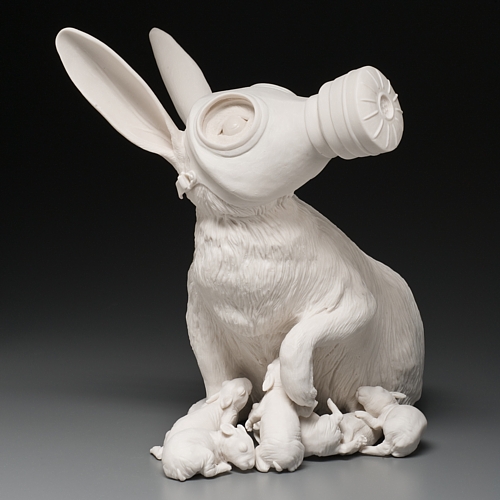
I found this image of a rabbit wearing a gas mask with it's young crowding around it quite strong, because it speaks not just of what will happen to us humans if we don't take care of our planet, but also of the creatures and families that aren't human that will be affected by our actions. This is rather the message I had been wanting to get across originally, that though we think this is our planet, it belongs to all the animals and plants that share it, not just us, and that we need to learn to respect it, and all we share this planet with.
Though I won't use this idea for this project anymore, it is something I will look at using in my art in the future, so I don't believe any of this research will go to waste, which is why I am putting it in this blog now, even though it is not relating to my current project anymore.

http://www.care2.com/news/member/261964452/2314937


Banksy is a very well known anonymous graffiti artist.
This is another piece that I feel is very strong, but in this case it is more related to what we as a species has lost, as we change our environment from the serene and wild forests that filter the CO2 from our air, and the pollution from our souls, into broken cities and false utopia's.


                              ++                            ++                             ++
(08/04/2013)

Enamelled Badges Research

Link

Link

Link


I will add more research here as I go